


Read the Full Series
This article is one part of a walkthrough detailing how we recreated an NXP i.MX 8M Mini–based computer using Quilter’s physics-driven layout automation.
If you’ve ever spent hours clicking through menus, dragging components, and wrestling with design rules in traditional PCB tools, you know how much the user interface can shape your productivity. But what if you could tell your software what you want, and let AI handle the busywork? In this post, we’ll compare the UI philosophies behind today’s leading PCB design platforms and show how Quilter’s declarative, AI-powered approach changes the game.
This is written for engineers and PCB teams evaluating PCB design software, especially anyone searching for a practical PCB user interface comparison, the tradeoffs of AI-driven PCB layout, and what a declarative UI looks like in real PCB automation.
What Makes a PCB Design Interface Easy—or Hard—to Use?
Most PCB tools are not hard because routing a trace is conceptually difficult. They are hard because the interface asks you to remember where everything lives, which panels matter right now, and which of the fifty configuration dialogs actually controls the rule you care about.
Three UI friction patterns show up again and again in legacy PCB design software:
- Visual overload: dense toolbars, stacked panes, and modal windows that compete for attention. You can do anything, but you pay for it in scanning, searching, and context switching.
- Hidden power: critical workflows buried in hotkeys, right-click menus, or deep configuration trees. New engineers do not know what they are missing, and experienced designers spend time teaching muscle memory instead of design intent.
- Step dependency: you must do things in the right order, in the right tool mode, in the right context. Miss one precondition and you spend 20 minutes unwinding it.
That friction directly impacts the two things teams feel most: speed and confidence. Onboarding a new engineer takes longer. Reviews are harder because intent is not explicit. Iteration slows down because small changes cascade into a lot of manual rework.
The irony is that as boards get more complex, UI matters more, not less. Multi-rail power, high-speed constraints, dense connector breakouts, and mixed-signal partitioning all increase the number of decisions you must encode. If the UI makes those decisions hard to express and verify, the interface becomes the bottleneck, even when you have great designers.
Let’s Define: Declarative vs. Imperative UI in PCB Tools
A useful way to compare PCB UIs is to ask: does the interface make you tell the tool what to do, or does it let you tell the tool what you want?
Imperative UI (traditional PCB tools)
Imperative UI is step-by-step. You place parts, route nets, push and shove copper, tweak rules, re-run checks, and iterate by hand.
PCB-specific example:
- “Place these decoupling caps next to the IC.”
- “Route this differential pair at 100 ohms, length match to 5 mil.”
- “Move this connector 4 mm and re-route the impacted nets.”
- “Run DRC, fix violations, repeat.”
You are the execution engine. The tool is a powerful workbench.
Declarative UI (Quilter’s philosophy)
Declarative UI is outcome-first. You define constraints, goals, and what must be true, then the system generates and evaluates candidates.
PCB-specific example:
- “This is the board outline.”
- “These connectors are fixed here.”
- “These nets are impedance-controlled, these are differential pairs, these need length matching.”
- “Prefer fewer vias, keep critical loops tight, meet manufacturing rules.”
- “Generate candidates, show me the best, and explain what passed or failed.”
You are the design intent owner. The system does the execution and the exploration.
A simple analogy:
- Imperative UI is like driving stick shift in city traffic. You control every action, but it is tiring and error-prone under pressure.
- Declarative UI is like setting a destination and constraints in a navigation app. You still decide where you are going and what roads to avoid, but you do not manually manage every turn.
Here’s a simplified diagram of the two mental models:
Imperative (manual) Declarative (AI-driven)
Intent -> Actions -> Result Intent -> Constraints -> Candidates -> Review -> Result
(you execute) (system executes and explains)
Why this matters for productivity and error reduction: imperative workflows concentrate effort in the “doing” layer, which is where repetitive mistakes happen. Declarative workflows shift effort to the “defining and reviewing” layer, which is where engineering judgment is highest leverage.
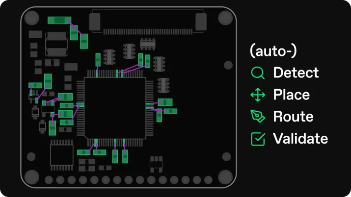
Quilter’s positioning is explicitly built around that shift: it is not a classic autorouter, and it is not an LLM assistant. It is a physics-driven system designed to generate complete layouts and evaluate them against constraints, so teams can iterate rapidly and transparently.
How Do Traditional PCB UIs Stack Up?
A fair PCB user interface comparison should separate two things:
- how approachable the interface feels day one, and
- how efficiently it scales when you are doing dense, constraint-heavy work.
Below are practical UI profiles of common tools. This section focuses on UI and workflow feel, not pricing or capabilities.
Altium Designer
Altium’s UI is modern, highly configurable, and built for professionals who live inside the tool. You get dockable panels, a deep rules system, and polished interactive routing. The tradeoff is density: the UI rewards expertise, but it can feel heavy for casual users. The Altium ecosystem also leans into a unified environment where a lot is possible without leaving the tool, which increases both power and surface area.
UI strength: cohesive pro workflow once configured
UI friction: visual density and “where is that setting again” moments
KiCad
KiCad has improved dramatically over time and is a strong example of an engineer-centric UI that is consistent and increasingly modern. It is also a tool where discoverability can lag behind power: if you do not know the right mode, hotkey, or context menu, you can miss efficient workflows. Its open-source nature also means UI conventions can feel different across features, depending on what you are doing.
UI strength: clean, capable, cross-platform
UI friction: fewer “guided” workflows, more learned behavior
Eagle / Fusion Electronics
Eagle historically appealed to approachable workflows for smaller designs, and Fusion Electronics brings that into a broader CAD shell. The UI tends to feel simpler than enterprise suites, with fewer panels competing at once, but complexity grows quickly when you push into dense constraints or larger designs.
UI strength: lower barrier for many users
UI friction: scaling into complex constraint-heavy work can feel limiting
OrCAD / Allegro-style ecosystems
Cadence tools are powerful and widely used, but their UI often reflects long-lived enterprise workflows: lots of configuration surfaces, structured constraint management, and many ways to do the same thing. Constraint Manager is a great example: it is strong, explicit, and spreadsheet-like, but it also adds another UI “plane” you must manage alongside layout.
UI strength: explicit control and deep constraint tooling
UI friction: steep learning curve and heavier configuration overhead
Web-first tools (like EasyEDA) and “friendly desktop” tools (like DipTrace)
Web-first UIs can be very approachable: fewer modes, clearer icons, and easy sharing. The tradeoff is that many advanced workflows rely on simplicity, and large designs can feel constrained by the UI model. Friendly desktop tools tend to sit between hobby and pro: a cleaner UI than enterprise suites, but a smaller ecosystem of advanced workflows.
UI strength: fast onboarding
UI friction: advanced constraint workflows can be less central or less scalable
Summary table: UI feel at a glance
Tool
UI personality
Best for
Common UI pain point
Altium
Modern, dense, configurable
Pro designers, complex boards
Too much surface area at first
KiCad
Clean, technical, improving
Cross-platform teams, open-source
Discoverability and mode learning
Eagle / Fusion
Approachable, integrated CAD shell
Smaller teams, simpler boards
Scaling into dense constraints
OrCAD X / Allegro-style
Enterprise, constraint-forward
Large orgs, strict requirements
UI complexity and training burden
Traditional UIs are not “bad.” They are workbenches built for human execution. The problem is that as layout becomes the pacing item for hardware teams, the UI becomes the limiter. That is exactly the gap Quilter targets.
How Does Quilter Change the PCB Design Experience?
Quilter’s interface is designed around a simple bet: the highest-value human work in PCB layout is deciding intent, constraints, and tradeoffs, not manually pushing copper for days.
Quilter’s product structure reflects that. Quilter describes two connected parts: a “compiler” that accepts PCB layout requests and generates designs, and an “app” where you configure jobs, submit them, and review candidates. The emphasis is reliability and clarity in what the system will do and what it will not do.
What you do in Quilter (UI-wise)
Quilter’s UI is centered on configuration and review:
- Upload your existing project files
Quilter works with existing CAD workflows and returns results in the same format you submit, so you can run DRC and finalize in the tools you already use. - Declare constraints and fixed decisions
Board outline, keepouts, pre-placed connectors, stack-up preferences, impedance and differential pair requirements, manufacturing constraints. - Generate many candidates in parallel
Quilter is built for parallel exploration, producing many layouts and ranking them for constraint coverage and manufacturability. - Review candidates with transparent checks
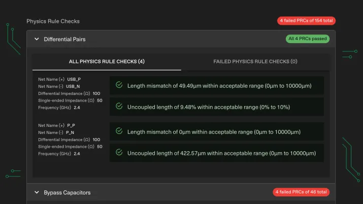
Candidate Review gives you tools to filter, sort, inspect layers, and understand Physics Rule Checks (PRCs), including what passed and what needs attention.
What remains under your control
A declarative UI does not remove control. It moves control up a level.
- You still decide constraints and priorities.
- You still choose which candidate to accept.
- You still polish and sign off in your native CAD environment.
- You still own exceptions: the weird mechanical detail, the special via strategy, the one-off EMI risk.
The difference is that the default workflow is: define intent, generate options, review outcomes.
A practical workflow diagram you can reuse in the post as a graphic:
Upload project -> Set outline and fixed placements -> Declare constraints -> Generate candidates
-> Filter and sort -> Inspect layers and PRCs -> Download chosen candidate -> Finalize in native CAD
If you want to embed motion, Quilter’s site already uses short workflow videos that map well to this story: upload and workflow fit, physics-aware design, iteration, and review.
What’s Different in Practice? (Then vs. Now Table)
Below is a task-level comparison you can use for a featured snippet style answer to “comparing user interfaces of pcb software.” It shows why “AI-driven PCB layout” is not just about speed. It is about moving the UI from “do everything manually” to “declare and review.”
Task
Traditional UI steps (imperative)
Quilter UI steps (declarative)
Set rules for high-speed nets
Open rules/constraints panels, define width, spacing, impedance targets, assign to net classes, validate in multiple views
Declare constraints once in job setup, then evaluate candidates against constraint coverage and PRCs
Place 50 decoupling capacitors
Manually cluster and rotate parts, enforce spacing and keepouts, iterate as placement ripples
Let AI placement propose a physically grounded placement, then adjust only what is unique
Route a dense connector breakout
Interactive routing, shove/drag, manage vias, keep return paths clean, run DRC, fix, repeat
Generate multiple candidates with different routing tradeoffs, then filter by via count, constraint coverage, manufacturability
Re-route after moving a connector
Move connector, assess impacted nets, rip-up and re-route regions, re-check clearances and lengths
Update the fixed placement constraint, rerun job to regenerate candidates, compare best candidate delta
Check “is this board done?”
Run DRC, then manually inspect critical nets, length match reports, impedance settings, layer-by-layer review
Use PRCs and candidate review to see which physical constraints are met, and what needs attention before download
Explore alternative stack-ups or manufacturers
Duplicate board settings, update stack-up rules, revalidate constraints, expect substantial reroute work
Try multiple stack-ups and manufacturing assumptions in parallel by submitting variations, then compare candidates
Handoff for final checks and fabrication
Export manufacturing files, validate again in your CAD flow, coordinate with fabrication constraints
Download the chosen candidate in original format and finalize in your native tool
What the table really shows: traditional UI is optimized for executing a single layout. Quilter’s UI is optimized for exploring a solution space and selecting the best candidate, with explicit visibility into constraints and physics checks. That changes the day-to-day experience from “perfect this one board” to “compare, choose, and iterate.”
What Results Can You Expect with an AI-Driven UI?
When teams ask about switching interfaces, they usually mean: will this actually move deadlines, reduce errors, or free up bandwidth?
Here are the practical outcomes that follow from the declarative model described above:
Faster iteration, not just faster routing
Quilter is built to generate multiple candidates in hours and enable parallel exploration, which changes how many design variants a team can realistically consider. Instead of one “golden layout” slowly evolving, you can compare multiple viable options and choose based on the tradeoff you care about.
Fewer manual, repetitive errors
A lot of PCB mistakes are not “you do not know how electronics works.” They are “you missed a detail while executing a long checklist.” Declarative UI reduces the amount of checklist execution you do by hand, shifting effort to validating constraint coverage and reviewing exceptions.
Quilter’s docs emphasize that Candidate Review is built to help you explore, inspect, and refine candidates, including sorting and filtering and reviewing PRCs. That is exactly the UI scaffolding that reduces missed details in review cycles.
More engineering time spent on high-value decisions
Quilter’s core pitch is about removing layout bottlenecks so engineers can focus on the complex tasks that drive breakthroughs, rather than spending weeks on non-core layout tasks.
If you want a short “case snippet” style line for this section, Quilter’s own messaging frames the payoff as making iteration abundant and reducing the need to “nurse one layout for weeks,” which maps directly to bandwidth gains for teams without unlimited PCB specialists.
Ready to Try a New Approach?
If you are evaluating PCB design software and your real pain is interface friction, onboarding time, or slow iteration, a declarative UI is worth testing. Quilter works with existing workflows, accepts common project formats, and returns results in the same format so you can finalize in the CAD tools you already use.
Next steps:
- Explore how the platform works: Product and Workflow
- See how candidate review and PRCs are presented: Support
- Or jump straight in: Try Quilter Free